An Introduction

I first became interested in 4AD, a UK independent record label founded in 1980, towards the end of the '80's. I was falling in love with the music of Dead Can Dance, Clan of Xymox, Pixies, Bauhaus and The Birthday Party and was surprised when the 4AD label sampler "Lonely Is An Eyesore" came out in 1987 that all these bands were from the same label.

After visiting a Pre-Raphaelite exhibition of some American's collection of art, I came to thinking of all this musical art that 4AD have released that may one day drift into obscurity unless someone shows it as art. So now I'm on a crusade, to collect the first ten years of 4AD's releases and exhibit the collection on 4AD's 50th anniversary in 2030. This is a big task which will have some interesting twists and turns along the way.

Showing posts with label Vaughan Oliver. Show all posts

Wednesday, 11 November 2015

Top Ten 4AD Covers, What's Yours?

A reader got in touch with me recently and asked me to do a feature on my top 4AD cover designs (Thanks Ar Ti).

The late seventies and early eighties independent music labels became renowned for their artwork. Of course 4AD, along with Factory, became synonymous for a label identity created through their cover art. All art is so very subjective. I did a blog entry on my favourite 4AD albums, but I'm sure there were many people that scratched their heads wondering why I picked what I did. I think visual art is even more subjective and opinion seemingly more open to ridicule. Nevertheless, I know what I like and why. My opinion has been asked for so I shall give it.

It is my opinion though which tends to cause some arguments. I have always had an issue between the lines of art and function or art and business. The past couple of decades have seen very clever people in business using clever strategy to sell something as art, that basically isn't art at all. Many of us are drawn to limited numbers, a special opportunity to experience something that only the appreciative will get to experience, but marketing anything as limited doesn't make it an instant collectible. Limited edition Mars bar anyone? In a similar way, just because something is marketed as art, doesn't make it art in my opinion. Designers are the problem. That half way house where an artist uses their talent to spruce up a functional item. While I respect the talent, I think many of these examples are simply not art. If a ceramic artist creates a cup, it's still a cup, no matter how talented the artist is. Selling it as a piece of art is just marketing. A cup is not made to represent any kind of emotional state or to represent the feelings or despair of its maker, it's simply to drink out of. A car is a functional item and, while it is nice to drive a nice looking car, it's not a work of art. Instead it is an object that has had the food budget of a third world country spent on it just to get potential buyers to go weak at the knees at the sight of it rolling around the streets of an eerily deserted city road.

The music industry is where sonic art meets visual art and a greater clash between representation and pure marketing uncomfortably meet. There's a blurred line between music made purely for commerce, cleverly marketed and packaged as the "real deal" against music made by artists that primarily make music to express themselves. My opinion is that designers for labels such as Factory and 4AD, although true artists, inadvertently helped blur the lines between function and art. For me album design is just on the right side of art, like a beautiful piece of painting on the side of a cup. The cup isn't neccasirly art, but the painting is. It doesn't matter how much artistic talent a designer has, if their work is poured into a functional item, for me the item doesn't become art.

But then I am an over opinionated walrus!!!

I've always loved the visual side of collecting music. I was always in awe of Roger Dean's designs in the seventies of strange other worlds on his Yes album covers. There was nothing better than sitting listening to Budgie's Never Turn Your Back On A Friend while studying the gorgeous full colour gatefold sleeve


I always thought that the Cocteau Twins cover design for Love's Easy Tears was very similar to Pink Floyd's Meddle


Anyway, onto my top ten 4AD covers, in no particular order, let's get on with it...


1 - Birthday Party - Junkyard


You may think that I would completely bow down to 23 Envelope but thats not true. I don't care for popular opinion or trend of thought. Just because I love much of what 4AD produced, there is no rulebook that says I have to be elitist in my personal taste.

This picture was created by an artist called Ed Roth who was a custom car designer and builder who put his talents into cartoons and illustrations. His character Rat Fink (with the gun) was a sort of alternative Mickey Mouse. I think that this cartoon represents the music perfectly, tight and structured while on the verge of chaos and both simultanious implosion and explosion.

2 - Dead Can Dance - Aion poster


Not the actual cover, but the UK tour poster. I like the actual cover of the album itself which is a very small part of the Garden Of Earthy Delights by Hieronymus Bosch. The poster covers the tour around the UK for the Aion album, a tour I had a chance to witness but regrettably I didn't go to. The tour poster is probably my favourite peice of 4AD artwork and looks fantastic framed and displayed. The quality of the colour and print is remarkable and must have cost a sweet sum to have had printed. If you ever get a chance to purchase this, you won't be disappointed. Of course the album is amazing too and featured in my Top 10 4AD Albums list (in fact, a lot do, so am I biased towards the sleeve design).

3 - Dead Can Dance - Within The Realm of a Dying Sun


This cover always reminds me of Joy Division's Closer album cover in a small way. It's a step between life and death as the figure almost looks like an actual person cloaked and not an actual statue in a graveyard. The cover's photograph was taken in Paris, at the Père-Lachaise cemetery. It features the grave of the politician Raspail. Can you get more gothic than this and could the music be anymore gothic as well. Another fine example of the cover reflecting the mood of the music therein.

4 - Colourbox - Baby I love You So


I'm a sucker for reds. I know nothing about the images on this release, I just love the feel of the image. Very velvety. Let's hope that somewhere out there, there exists a poster for this. For me the font and text are irrelevant. "Sacriledge!" I hear you scream, but this is where function has to be performed for me. This would be even better without the text, yet maybe the 45 in the centre I would let stay. Don't get me wrong, the choice and style of font and the presentation of text is amazing, but it is functional in my opinion and would be better without it. But needs must as the devil grinds the marketing wheel. Still an amazing cover though

5 - Le Mystere Des Voix Bulgares - Le Mystere Des Voix Bulgares


Used for the background of this blog. Reminds me of a drowned former glamourous life like a memory on a sea floor of some luxury liner. I wouldn't say the music is as atmospheric as the cover suggests, perhaps one small example of where the cover doesn't always accurately reflect the music within. I love the music on this album, but Bulgarian folk music can be quite harsh and beautiful at the same time, something not really reflected here. Still as a piece of artwork stood alone, it's a magical piece of photography.

6 - Pixies - Doolittle


The original UK release of Doolittle came as such a great package. A plastic bag with the cover printed on it, a full colour 12" 16 page booklet and an inner sleeve. Also 4AD sold a set of postcards with the artwork from the booklet. This is a full art set, an amazing collection of photography reflecting the songs of the album. The graphical element added to the overall look of the artwork and fits the metronomic feel of the songs. The images fit so well with the music on the album, even if the cover is overtly obvious with it's interpretation of the song Monkey Gone To Heaven, the artworks only negative reflection.

7- Coctea Twins - Treasure


Maybe it's because V23 liked to reflect the music in their covers that I like a lot of the covers for Cocteau Twins releases. I like the music and the covers reflect the music, so it should go that I like the covers as well.

This cover for me is very gothic. Hints of the Victorian and a melancholic wedding. The use of material gives you a reminder to your senses of something that you have have touched before and felt in your fingers, material that feels soft to the skin but coarse between a finger and thumb. Eerie and beautiful, it looks almost derelict, decaying. Incredible gothic beauty


8 - Cocteau Twins - The Spangle Maker


Victiorialand would be included in my top ten except for the beige surround which ruins the cover. But The Spangle Maker is a beautiful piece of work.

The original UK release came with an embossed sleeve where the frame was slightly raised around the photograph by Gertrude Käsebier called The Crystal Gazer. Once again that Victorian feel blends with the gothic feel of the music and the blurred, distorted edges reflect the wash of effects used on the Cocteau Twins signature guitar sound. There are no fonts and text needed here. The tour poster is quite an incredible piece as well.

9- Cocteau Twins - Head over heels & Sunburst and Snowblind


Head Over Heels along with Sunburst and Snowblind is just the most brilliant photography. Nigel Grierson did some of the most unusual things to get shots like these. The high quality and sharpness in the variation of colour is just breathtaking. The photos encourage you to not only look deep into the detail and the range of colour, but to look more closely at the every day beauty around us all in the seemingly randomness of patterns in nature, things you wouldn't normally look at closely. A set of posters from these photography sessions looks incredible framed and mounted. I know as I have them in my hallway.

10 - Lush - Scar


The reason I have included the rear sleeve here is because the whole cover (even inside the outer sleeve) is a collective work of art. Once again it reflects the harsh and soft combination of the music. If this is shoegaze, those are some interesting footwear. This was released in an era when computer generated graphics were all the rage and years on look really tacky. But here Vaughan Oliver and Christopher Bigg have resisted the trend and produced something much more timeless.

All comments are welcome, remember these are just my personal choices and opinion, which I have a right to, even if you think my opinion is total tosh. Would love to hear your preferences....

Thursday, 1 August 2013

What colour is a lazy streak?

So what is happening of late. Well I went through a spate for a short time of finding lots of collection pieces on Ebay for a very reasonable price. For two weeks I was struggling to keep up with the flow of reasonable priced items on offer, and then with a bump just stopped. This wasn't from a single source but from all over the place, from the UK, from Europe and even from the US with a decent postage amount. Why the sudden peak of items and then hardly anything again, I have no idea.

Needless to say that my usual roller-coaster ride of interest and then general annoyance with myself and this stupid idea of doing this collection has made it's usual route of peaks and troughs. At the moment I'm in-between moods. Trying to persuade myself what a wonderful thing it is to collect such wonderful music and respect such great artists and then thinking that perhaps I should be slapping myself around the back of the head with a very large wet haddock for taking such a journey on in the first place.

I'm generally a lazy person. Being lazy and sitting on my fat arse is the major default setting for me. After being at work all day, the ONLY thing I want to do when I get home is sit in a nice comfy chair. Perhaps I may be persuaded to switch the TV on, maybe I will browse the interweb, but mostly it's pastimes that involve sitting. I reckon my brain also has the same desire. My brain also goes to work all day and wants to just go home and relax in a bowl of comfy warm mush. Even while writing this, my brain has had enough of working for the day and wants to just do as little as possible. That's not actually easy for me, I have a brain that never shuts up or winds down, I'm mentally on the go all the time, so my brain also nags me to just slow down a little by doing as little as possible. This of course includes doing this blog, or updating facebook, or joining in on a forum I'm a member of and, of course, all the other things I want to do generally in my life, such as sending an email to a friend and just staying in touch.


So now that I've put myself through a bought of flagellation and got my brain in gear (but still with fat arse firmly planted on sofa leather), what have I accomplished or found out since I last posted so very long ago. Well in the news......is the soon to be released 4AD book by journalist Martin Aston. Called "Facing the Other Way, the Story of 4AD". Set to be released on September 26th 2013, it will be the first official account of the label we love. Focusing on mostly the first 20 years of 4AD's history, it has the prestigious boast of having the cover designed by Vaughan Oliver and will also be available as a limited edition with 2 CD's of some of the labels musical history. Info here : 

As a warning to all those looking to try and pre-order the the book, be aware that Amazon do not have copies of the limited edition on order to sell to pre-orders made on Amazon. Amazon may get some copies if the publishers don't sell all the limited editions and have some left to pass on. I fell into this trap with Amazon before when they list something they may likely never get their hands on......so buyers beware.

On a slightly different note, I've started to notice a pattern of reprints of cassettes. I say reprints because they are not official re-releases, but an obvious sign that the originally made stock has run out and new batches of cassettes manufactured. Cassettes are really easy to spot because of the change in cassette design during the eighties. In the early eighties, cassettes were solid colour plastic, usually white or black, occasionally other funky colours to match the general colour of the album design but the coloured ones are much more rare. By the mid eighties though, a new fashion for seeing the workings of a mechanical object became desirable, the watch makers Swatch being one of the trendier items that everyone wanted which showed the gears and workings of the watch behind garish cheap clear plastic.


Cassette manufacturers such as TDK followed this fashion through, showing the tape wound up on the spools through clear plastic. Pretty soon, you couldn't get a cassette tape that wasn't trendy and see through and I suspect that 4AD had the same issue when ordering new stock. So there are distinct and obvious signs of a reprint of early eighties releases on cassette. This Mortal coil and Cocteau Twins albums are the first that I've noticed and I'm sure there will be more to be found.

So if you are interested in getting original cassettes for early eighties albums, stick to the solid colour plastics and not the clear.

Thursday, 15 December 2011

An Interview With Pieter Nooten

I don’t really get excited about celebrity, people are only human after all. Most celebrities are famous nowadays for having no talent whatsoever. I do have a great respect for some people who are talented though and show signs of being more than the average human. I then add greater respect for those talented humans that also have some semblance of realism and modesty. So that is probably why I don’t admire that many people as you can probably imagine. I find most people with talent have an equally sized ego to go along with it.

Don’t get me wrong, I know from personal experience, that in order to be able to perform in front of peers, you need to have some sense of ego to be able to pull it off successfully. There is nothing worse than watching an artist that has no faith in their self or their art. Then, of course, there is the matter of living in a world full of people with talentless ego’s who have an insane jealousy of those with real talent.

The saying goes that history is written by the victors. In the modern world is seems to be written by those with the biggest mouth and the biggest ego. Thankfully, in the modern age, there are also other folk with a passion for truth and an eye that can see past the egos and feather displays.


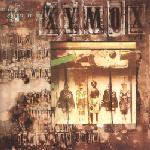
Were am I going with this, you may ask? Well, one musician I greatly admire is Pieter Nooten. Pieter was one third of Clan of Xymox in the eighties. The Clan of Xymox album Medusa made my all time top ten albums (see previous blog entry). Pieter Nooten was the man who edged Clan of Xymox away from being just another goth band, or just from being New Order mark II. I am very fortunate to have been able to put a few questions to Pieter just this last week :

Before meeting Anke and Ronny (who formed Clan of Xymox), what kind of bands were you playing with?

When I was around 16 I used to play drums and later the bass guitar; always involved with local indie bands. Later I bought one of the first tascam 4track cassette recorders and got into composing.

Was there a clear direction in music style when you joined Anke and Ronny (Clan of Xymox), or did your sound develop?

I met them in Nijmegen in 1980 when they were a duo and we got on together immediately, being influenced by the same bands and sounds of the time. We desperately wanted to merge the new developments in music (affordable synths, drum machines, triggering etc.) with the new guitar music of that era.

Was Subsequent Pleasures self released? Why were most of the original copies of Subsequent pleasures destroyed?

I was not involved with the making (or destruction) of SP.


We met Dead Can Dance when they toured The Netherlands for the very first time and Brendan introduced us to Ivo Watts.

How did you personally feel about the way the band was represented by 4AD’s artwork?

They came up with the basic design. We were great fans of 23 Envelope.


Brendan and I became quite good friends for a while; he was –just like me- a big admirer of medieval and baroque music as well as more contemporary minimalist composers like Arvo Part. Brendan and I should have worked together but it never happened.

What was it like to work for 4AD? Did you have any good relationships still going today?

Oh yes. Friends for life I would say, even though I may not speak to them on a daily basis. I still keep in touch with Brendan, Vaughan and Ivo.

On the Medusa album there are some wonderful, even progressive, changes and styles, which is unlike most of the similar genres typical output of the time. Where did this influence come from, and were these non-traditional methods of non verse - chorus structures universally enjoyed within the band, or did it cause tensions?

At that time I was massively impressed and influenced by contemporary classical music as well as the more experimental pop acts (Tuxedo Moon, Peter Gabriel, Kate Bush, This Heat etc…). I definitely wanted Xymox to develop an influential and ground breaking sound. But Ronny wanted to become famous and produce more commercial sounding material.

Did you have any influence in producing the Medusa album?

Absolutely. I wrote a lot of the material for that album (AND the first). At the time we were all involved with the mixing and production of the albums. john fryer was the main producer and we listened to him but also came up with our own suggestions. Sometimes we would all be hanging over the mixing desk, one changing e.q's and someone else adding velocity etc

How did the work for This Mortal Coil work come about, what are your memories of that experience?

Ivo had a tape of demos of me and simply asked me to deliver that particular song for TMC. John Fryer, Ivo and me recorded it in London.

Have you found a greater appreciation recently for your work done with Clan of Xymox, now that the more recent incarnation of the band shows a distinct lack of your flare?

What can I say… I do get mails now and then. I am proud of what I was capable of at such young age and happy that this inspiration has never left me. On the contrary, it has evolved. My music becomes more and more mature and drifts slowly further and further away from pop music.

How much did you contribute to Anka’s album? What was it like to work with her again? Are there any plans to work with with her again in the future?

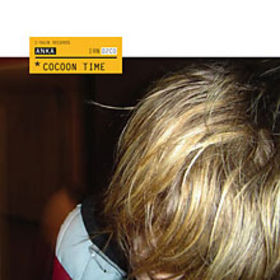
We both worked on Cocoon Time when we both lived in London and everything seemed to work out, before the record company that signed us sort of collapsed, as a prequel to what was going to happen to most of them later on…Anka and I have always worked together pretty nicely; we did most of the technical stuff with Xymox.


Absolutely. Mind you, I lost interest in most pop music at a young age already and my influences have always been kind of different. I do NOT have anyone in pop music to look up to so I am not trying to sound like anybody or anything. The music I write now, comes freshly from or should I say to, an open mind.

I have seen references that say you are the father of Dark wave, do you see any truth in that? Do you have any pride in your contribution?

I have never said such! Dark wave? What is that to begin with? Ha-ha.


It’s more cutthroat and backstabbing now than it was back then. But also, there is more opportunities then ever before. There is no money to be made from albums, and maybe that’s a good thing. Artists need to get out of their comfy zone to get noticed.

What are you working on now and what is inspiring you?

I have almost finished my next album. Nothing inspires me more then wonderful music but I am afraid it’s mainly music written centuries ago. This said, it doesn’t mean I am closed of from the present. I keep a close ear to any new music that’s out there.


To find out more about Pieter Nooten :


The music industry has never been kind to it’s artists, do you think the music industry is any worse today?

Is a more ambient direction a subconscious path or a consequence of age?

What are your memories of Dead Can Dance from those early encounters? Have you ever thought of working with Brendan Perry or Lisa Gerrard?

Do you recall how Clan of Xymox became involved with 4AD?


Monday, 11 July 2011

Majestic Art Or A Mug?

I met a work colleague last week who, I discovered after an interesting afternoons chat, did Graphic Design at University where Vaughan Oliver lectured.  Vaughan Oliver was the mastermind behind V23 and the design and identity of 4AD.

I have a love/hate relationship with graphic design.  I personally think that in the modern era it has helped to blur the lines between art and commerce to the point that we are all confused as to where the line exists.  Please allow me to explain.

4AD – or Vaughan Oliver, Nigel Grierson and V23, have done some incredible and beautiful designs.  One of this weeks purchases has been the Cocteau Twins CD single “Love’s Easy Tears” on Relativity from the US
<!--[if !vml]--><!--[endif]-->

Beautiful artwork that reflects the music really well.  Could it be argued that it isn’t art though?  To some maybe.

I have a problem defining the difference between art and manufacturing.  Ok, two extremes would be the ceiling of the Sistine chapel and a bolt.  But take for instance pottery, my greatest bug.  A mug created at a factory would not be considered a piece of art.  Stick a transfer on the side, is it then a piece of art?  Probably not.  What if the same picture was hand painted?  I still don’t think this is art, but some argue that it is.  What if the mug had two handles on it?  Now many would argue this is art, I still think it’s a mug and it holds tea.

I personally believe that record covers are an art form, some more than others.  4AD were always expressive with their covers, which along with the music, makes collecting them all the more enjoyable.

Whether this expression of art in graphic design holds true for a chair is one where I get a little lost.  Although functionality can be boring it can be alleviated by good design and good design can also help move units, I struggle to see art in the attempt to shift volume.  Maybe the same could be said for 4AD record covers, really they were designed for shifting units weren’t they?  I would like to think not.  I would like to think Vaughan Oliver, Nigel Grierson and V23 had fun messing about, experimenting and expressing themselves and the commercial success was more a lucky bi-product than a primary intention.

Maybe one day I’ll find out……….

Some of this week’s additions